.png)
.png)
Snapp! is known as the Uber of Iran with over 55 million users. The company is the largest and fastest growing internet company in the Middle East, a great app that offers many services, but it's a case study in ride-hailing as its most used service with 3.8 million rides per day.
Snapp provides powerful mapping services and APIs to companies, enabling them to integrate advanced mapping and location-based capabilities into their applications. To simplify integration and ensure efficient management, I designed two distinct panels: an admin panel and a customer panel. This case study focuses on the customer panel, exploring its features, functionality, and benefits.
.png)
The biggest challenge I faced was working on this technical project, which required engineering skills that were outside my expertise and hard to understand
To overcome this challenge, I made a point to collaborate closely with the engineering team. I set up regular meetings with product managers and engineers, which really helped me get a better grasp of the project’s complexities. I also spent time studying on my own, digging into concepts that would boost my technical knowledge. But in the end, it was the open communication and teamwork with the product and engineering teams that truly helped me bridge the knowledge gap.
To better understand the problem, I held meetings with stakeholders and product managers. Through these discussions, I identified the key requirements and issues, which I've summarized here as the Business Problems:
.png)
The goal is to create a customer panel to streamline the management and use of Snapp's map services, improving overall efficiency, simplifying the service acquisition process, and enhancing user interaction. we aim to measure our success at the end by evaluating these quality metrics to ensure that we have achieved our desired outcomes:
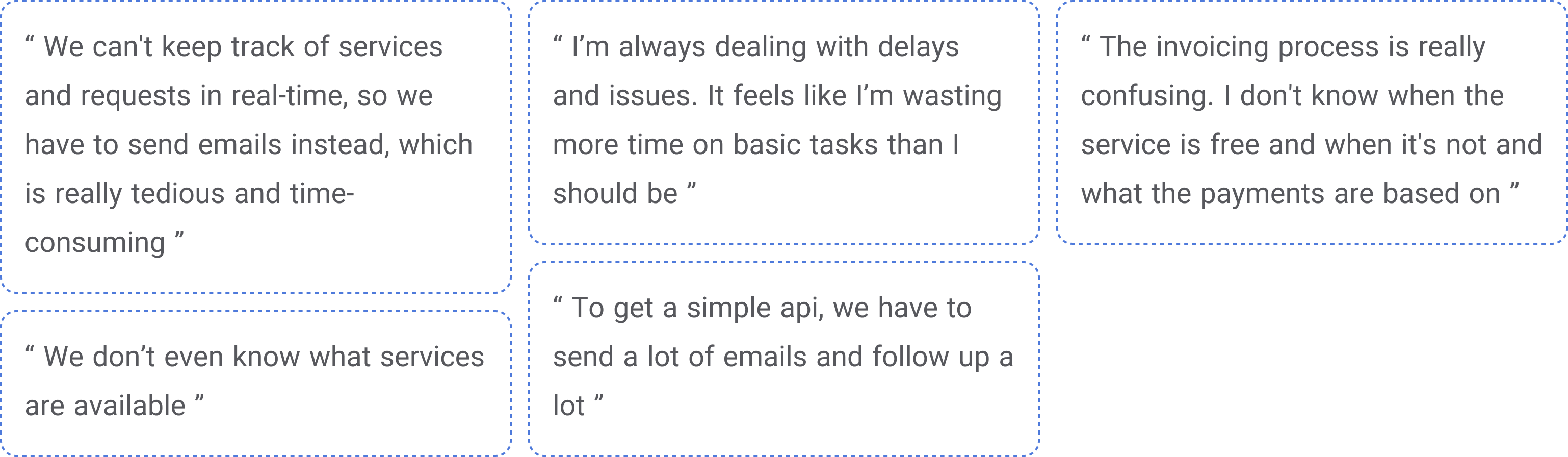
After understanding the core business problems, I needed to find out what specific issues users were facing with the current system. I chose to conduct interviews because I needed qualitative data to really grasp their experiences, and there wasn’t any other relevant data available. Since the end users were engineers, I felt it was important to get detailed insights directly from them, so I decided to speak with them in person. I interviewed five people who use our APIs, and these conversations revealed several key pain points that were impacting their daily workflows:
Based on business needs and user pain points, we selected specific features to address these issues. As this was for the MVP version, features were selected based on their feasibility and importance in collaboration with the product and technical teams. This approach ensures that we focus on the most critical and achievable solutions.
.png)
After finalizing the MVP features, we created a sitemap to guide us. This helped us organize the panel’s structure so that all key features were logically arranged and easy to access. It also kept our focus on user flow and functionality.
%25201.png)
In the following sections, I will walk through some of the key screens of the MVP, explaining their functionality and the design challenges we faced while developing them. Each screen reflects our efforts to create a user-friendly experience while overcoming specific hurdles related to layout, usability, and technical constraints.
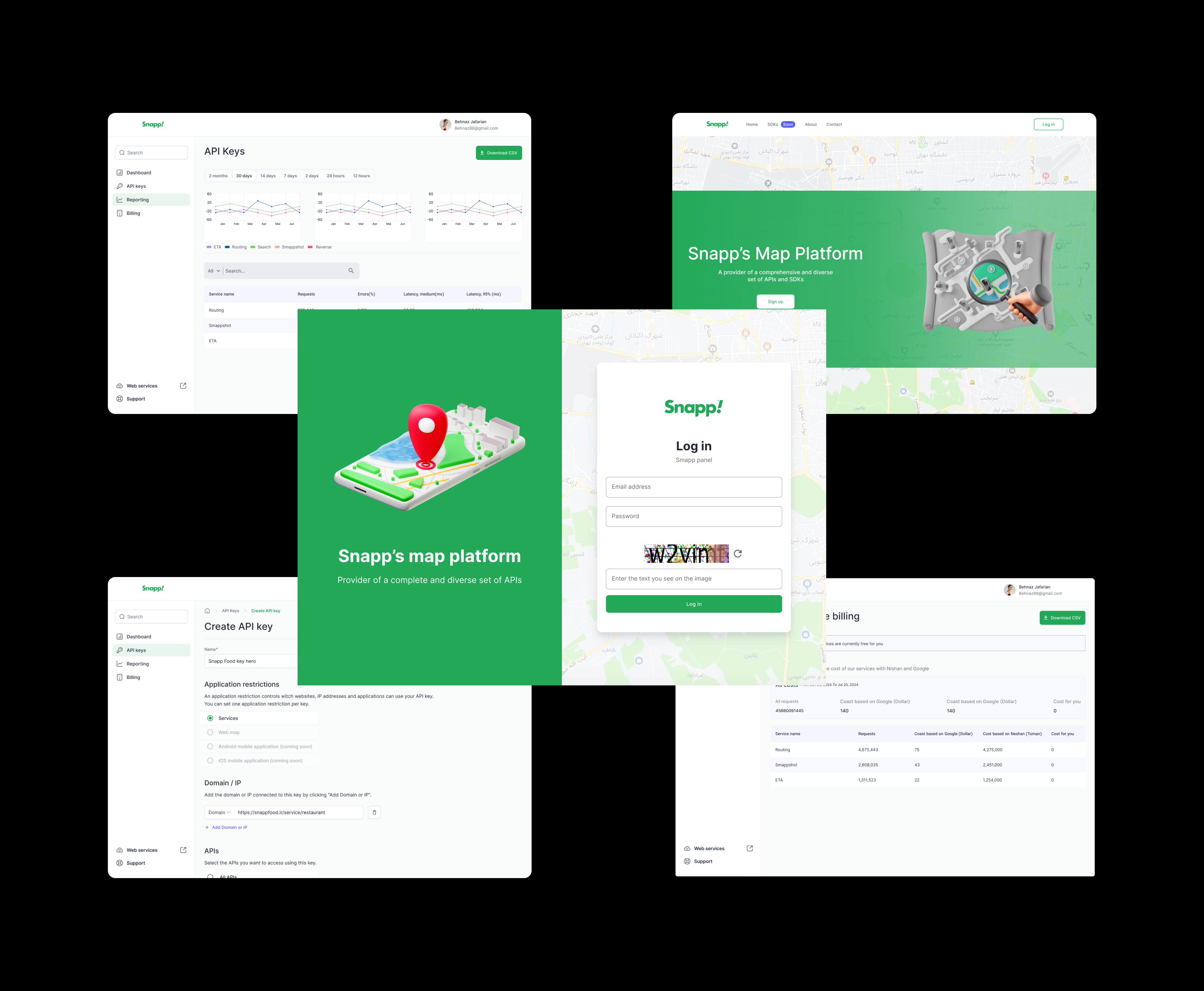
An API key is a unique key that allows users to access the services and features provided by Smapp. With an API key, users can access one or more services and apply their own specific settings on them.
We decided to display the API key creation process using a modal because it keeps the user focused on the task, which is important as we wanted to ensure the user’s attention remains on creating the key without distractions.
%25201.png)
After discussing with the product manager, we realized that in the near future, the number of services will increase, and the currently inactive services will also be activated. As a result because of the limited space, the content of the modal will expand significantly, leading to lengthy scrolling for users.
Finally we used page to creation process because of:
These benefits ensure that the page approach offers a more user-friendly and scalable experience as the product evolves.
%25201.png)
We used nested radio buttons because that was the best choice at the time. Adding new components to the design system was not possible and we had no other choice. This was also a challenge, as we were limited to using the components available in the design system.
On the "API Keys" page, users can create new keys, view a list of all the API keys they have created, and manage them.
The user should be able to view:
The user should be able to perform actions such as:
We used cards to display the keys in the first iteration because they’re easier to read, make actions quicker to access, and look more visually appealing.
%25201.png)
Since we didn’t want the design of the customer and admin panels to differ significantly due to time and implementation constraints, we needed a solution that could work for both. Given that the number of API keys in the admin panel would be much higher, using cards was not an ideal approach for the following reasons:
So, we decided to move away from the card design and look for a more scalable and user-friendly solution.
We decided to use tables instead of cards for the following reasons:
%25201.png)
The monitoring page provides key metrics like Traffic, Errors, and Median Latency, displayed in both charts and tables. Users can filter these metrics by Time, Keys, or Services, allowing for a focused analysis of the data. This setup helps users quickly identify issues and take corrective actions to ensure smooth system performance. The aim of this page is maintaining oversight and addressing potential problems proactively.
%25201.png)
The main challenge of this page was related to the charts. Given the time constraints and the importance of time for both the product and tech teams, as well as the limitations of the design system, such as a limited color palette, we selected the charts from the Chart.js library through close collaboration with the developer.
Since the project was an MVP with tight deadlines and scope limitations, we didn’t have the chance to do thorough testing before the launch. As a designer who values effective design, I convinced the product team to first launch the panel internally for Hobby’s own ventures. This way, we could gather usability feedback before a full rollout, ensuring the design wouldn’t be released to a large group of users without proper evaluation.
After launching the customer panel internally for Snapp’s ventures, I conducted a moderated usability testing with 5 admin users of the customer panel with following test scenarios.
1. Creating a new API key
2. Managing and editing existing API keys
3. Navigating the monitoring page and filtering data
This allowed us to identify the following key pain points:
1. Users had trouble identifying disabled items when selecting services and restrictions.
2. The process of selecting APIs using nested radio buttons during key creation seemed confusing for users, and the selection process was time-consuming for them.
To address the identified pain points, we made the following improvements to enhance the user experience and resolve the issues. We implemented three key improvements:
We added a “Coming Soon” label to disabled items so users can easily see at a glance that these services aren’t available yet but will be soon.
We added a tooltip that pops up when users tap on a disabled item, letting them know it's currently unavailable but will be ready soon.
Considering the expected increase in APIs in the future, we replaced the nested radio buttons with a multi-select component that was added to the system design after launch. The advantages of using this new component are increased efficiency, search functionality, and better space utilization.
%25201.png)
.png)
%25202.png)
After those improvements, we gradually rolled out the full 100%, knowing we had enhanced the user experience and prepared it for a broader audience. this was just the start of a long journey ahead.
Two months after the full release, we conducted user interviews to evaluate the quality metrics and determine whether we successfully achieved our goal for the MVP phase of the project:
These results demonstrate that our customer panel effectively met its goals and delivered the anticipated improvements in service management and user experience.
.png)
The technical nature of this work was challenging, but in the end it
turned out to be a valuable learning experience for me and I became
familiar with more technical concepts.
I also learned the critical importance of clear communication and
collaboration with cross-functional teams, which was essential
for bridging the gap between design and development.Overall,
this experience has made me more confident in handling
complex technical projects in the future.
With the completion of the MVP, our next step is to:
.png)