.png)
.png)
Snapp! is known as the Uber of Iran with over 55 million users. The company is the largest and fastest growing internet company in the Middle East, a super app that offers many services. This case study is about ride-hailing service which is the most used service with 3.8 million rides per day.
Based available data, benchmarking and heuristic evaluation, we discovered current design problems and then designed ideas based on our findings and benchmarks. The result was tested by usability testing, so we developed the solution and observed the metrics for a smaller number of users and then reached 100%.
As a product designer, I helped our research team in Reviewing data, did a competitor analysis, ideated, and designed the final solution.
.png)
.png)
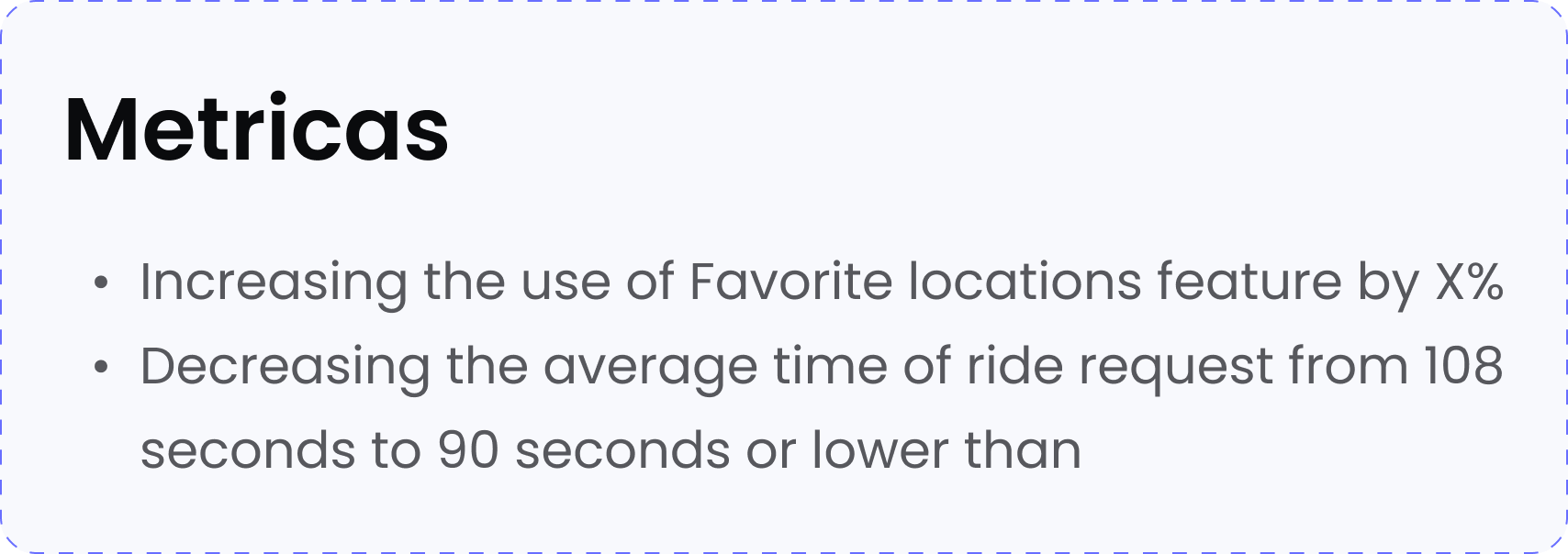
The favorite locations feature was added to the app
with the aim of reducing the average ride request
time from 112 seconds to 90 seconds. But based on
our data, it did not perform well to achieve the
intended goals, and this feature only reduced the
average ride request time by 8 seconds.
.png)
We wanted to improve the design of favorite
locations to achieve a significant reduction in the
average time of ride request, aiming to meet the
initial target of 90 seconds. But how can we know
if we have reached our goal if we can’t measure it!?

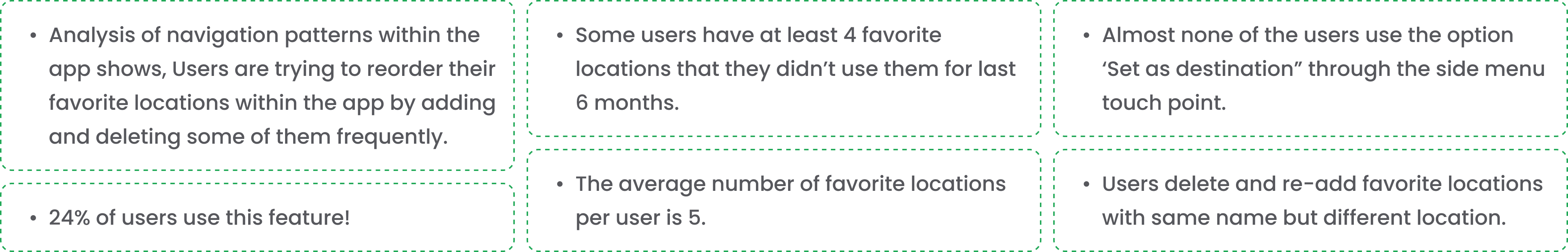
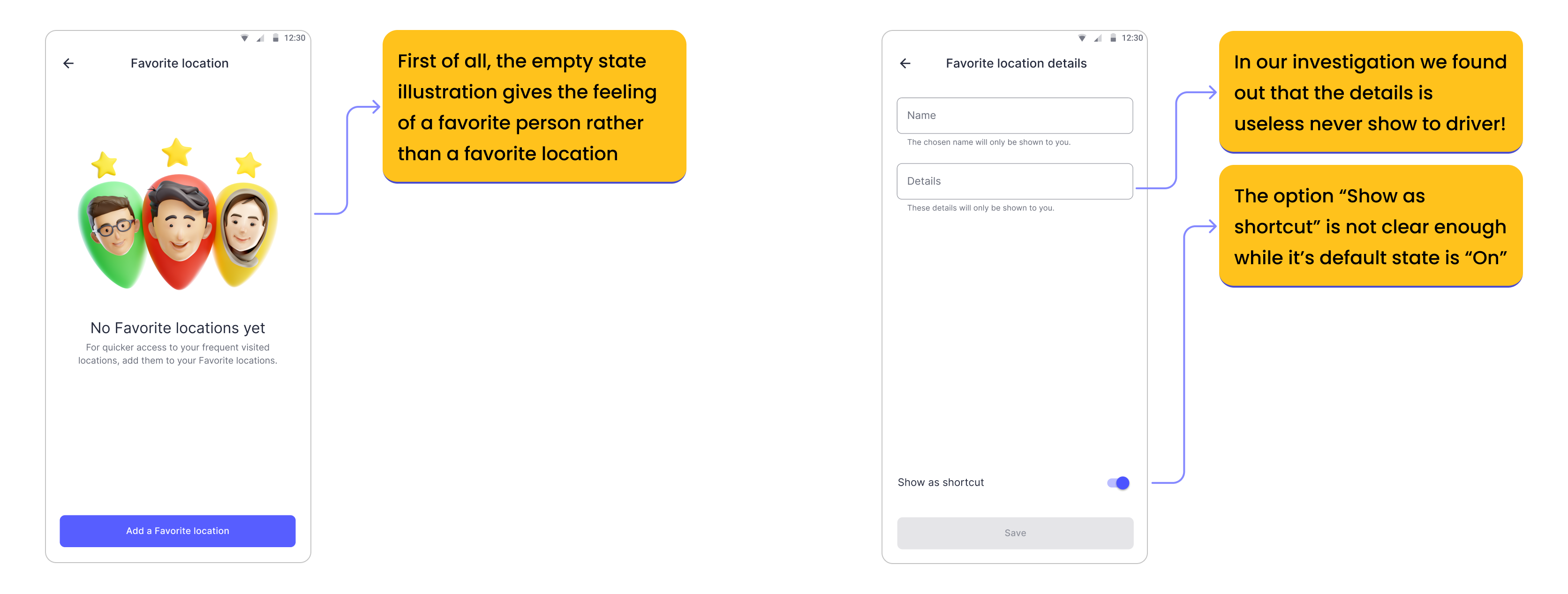
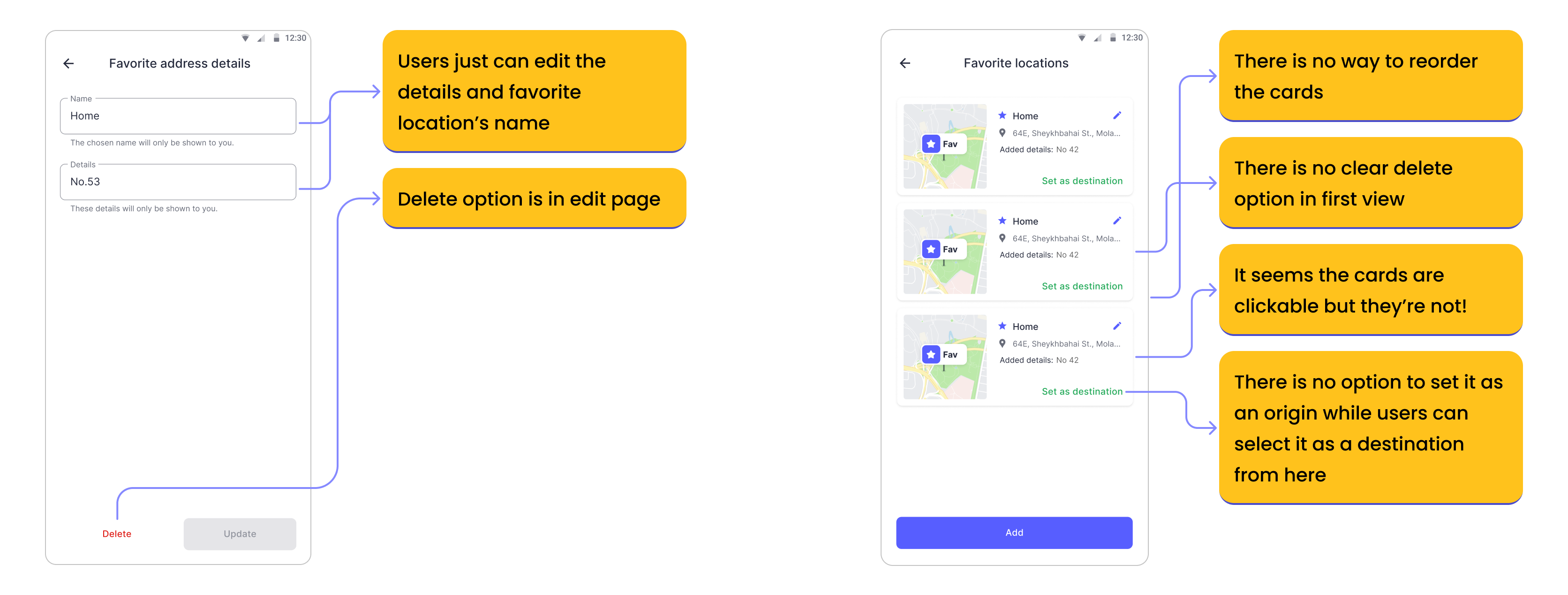
First, we had to understand why many users are
not using it and why this feature is not working
as we expected; So by using Clarity and the help
of the data team, the researcher and I, we
came up with the followings:
I checked popular apps like Tapsi, Neshan, Uber, Lyft, Grab, Waze, Bolt etc to have a closer look on features and interactions of Saved places page.
.png)
We reviewed the current design and based on our findings, specified where we needed to take action.

We held a meeting with the product and technical team and based on the findings and results obtained from the data, benchmarking and exploratory evaluation, we generally discussed the possible changes and improvements to ensure that the changes were within the project scope and schedule. We decided to make these changes to the snapp’s favorite locations:
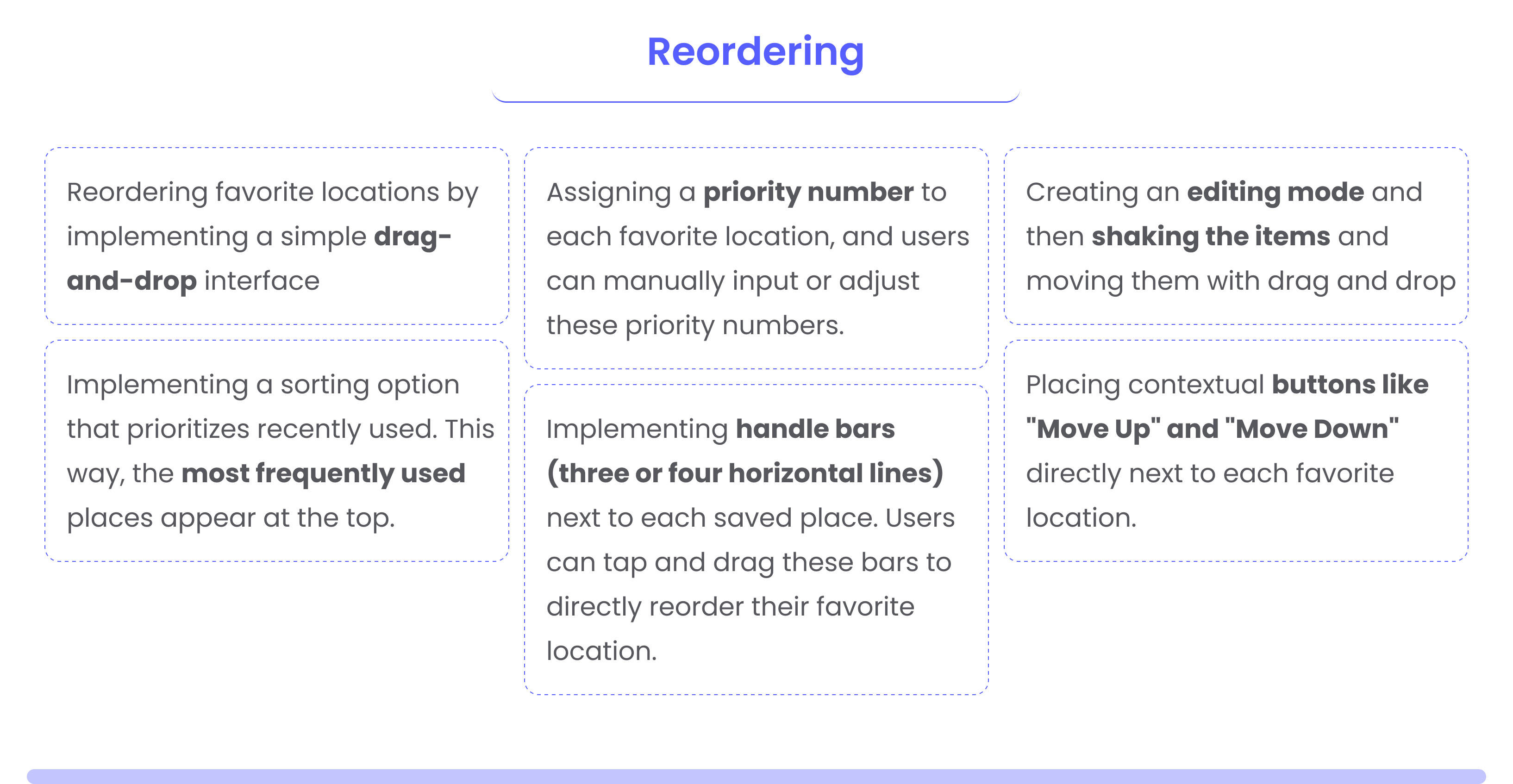
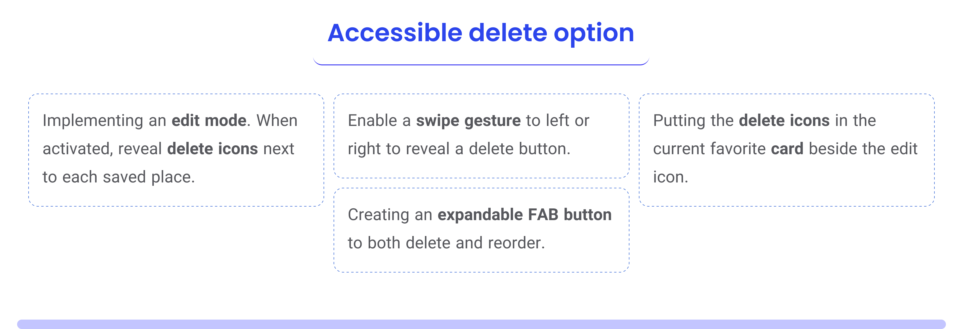
To find solutions for the problems we identified, we started brainstorming with the team and the product lead and categorized the ideas into four groups.
.png)
.png)
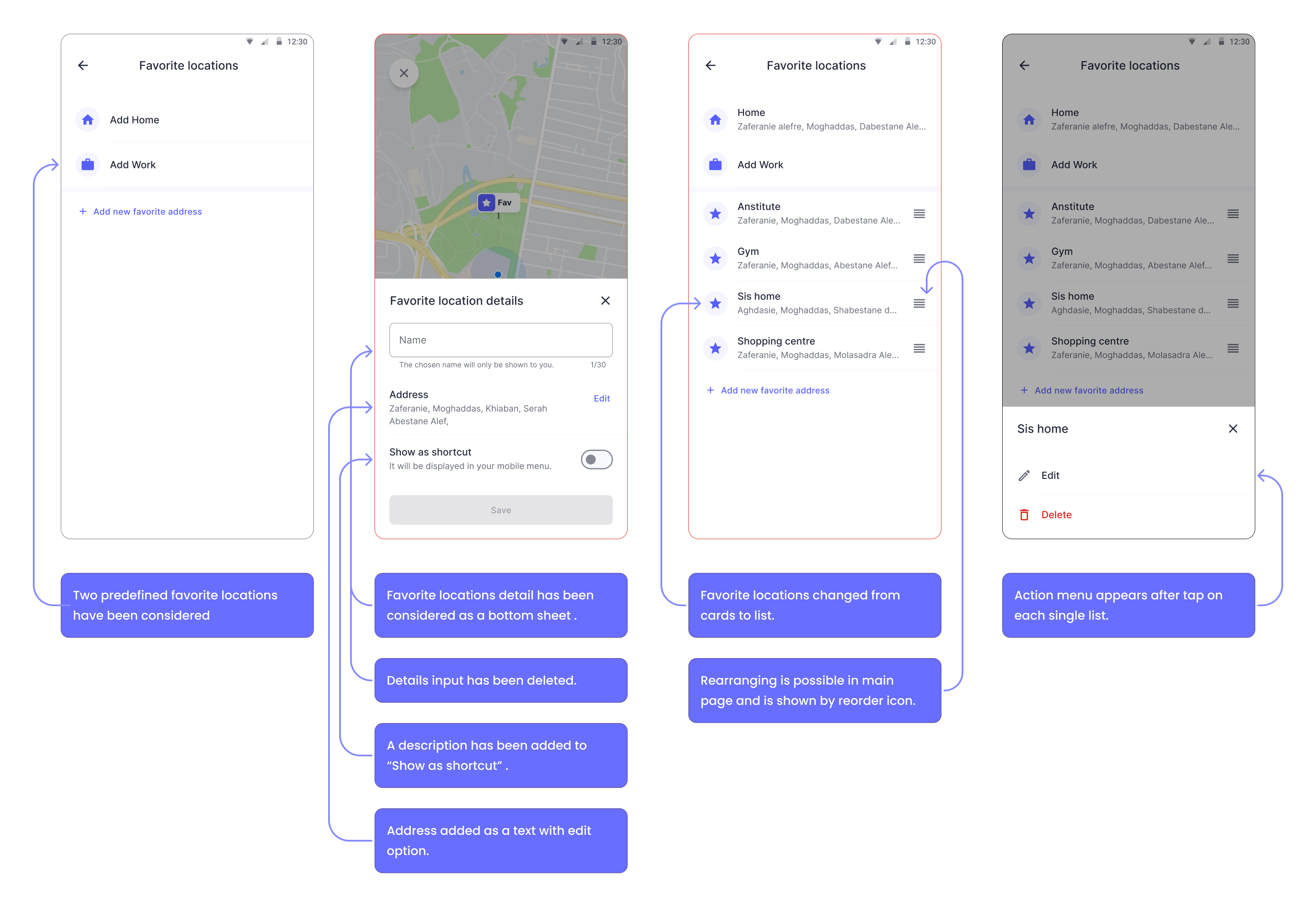
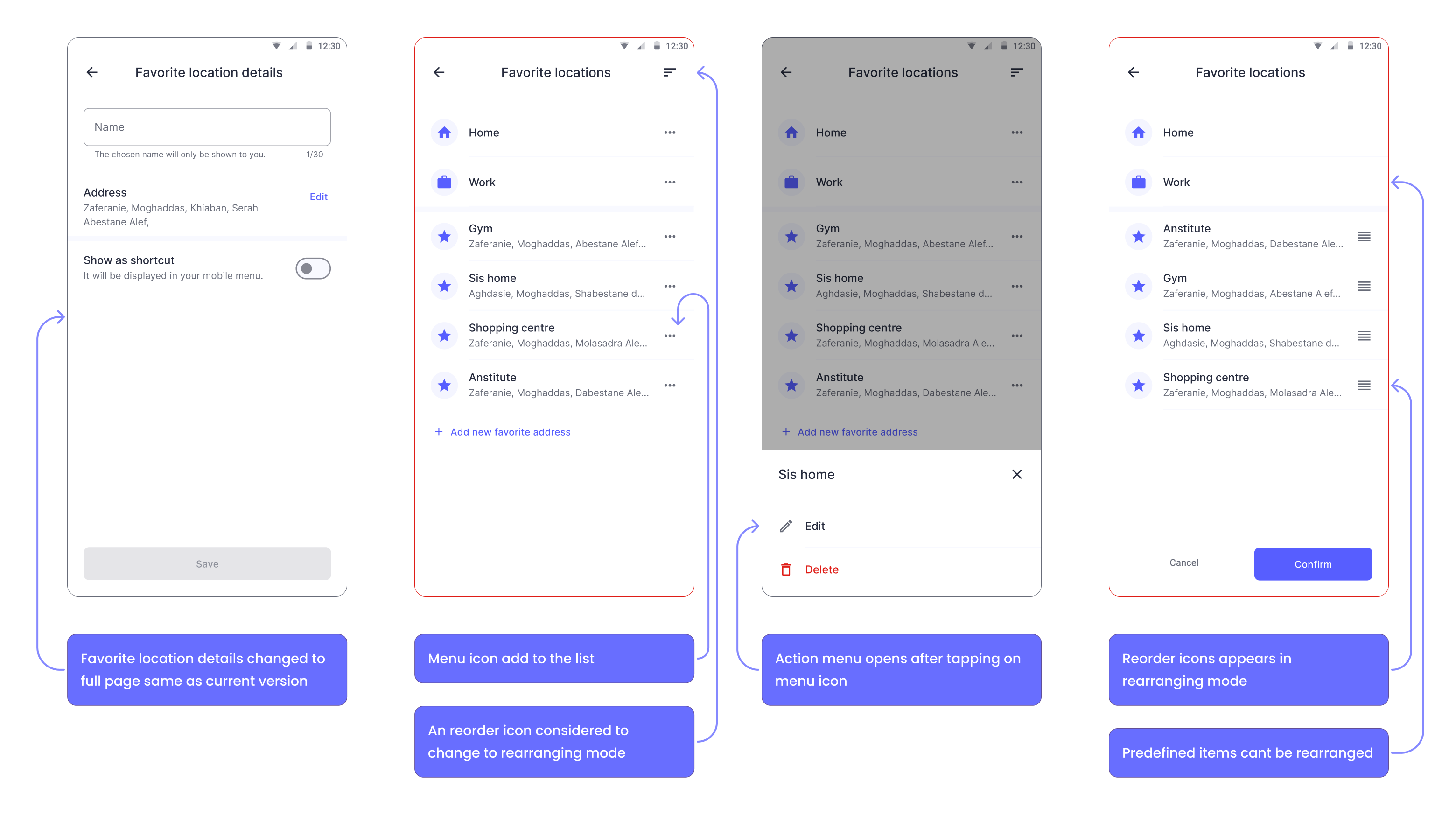
How did we solve the challenges?
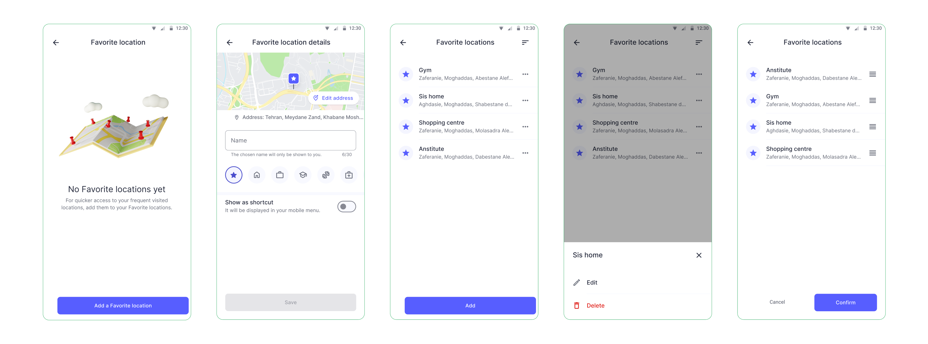
I've iteratively redesigned this flow, considering numerous possibilities and ensuring all corner cases are addressed and to facilitate a clear understanding for developers.
You can see the prototype here.
.png)
At first, it was rolled out for two percent of users and we tested its results with usability, and after seeing the positive results of usability, it was rolled out to 100%. We have done a thorough evaluation of our metrics since our full launch. The results show significant improvements, especially in two key measures:
For confidentiality reasons, I have omitted the actual values for these metrics.
These positive outcomes collectively underscore the success of the delete feature redesign and the arrangement feature of favorite locations, demonstrating its effectiveness in enhancing the user experience across various dimensions.
.png)
Navigating challenges highlighted the significance
of effective communication and collaboration
among cross-functional teams. Transparent
communication fostered a shared understanding
of priorities and facilitated collective efforts to
overcome obstacles.
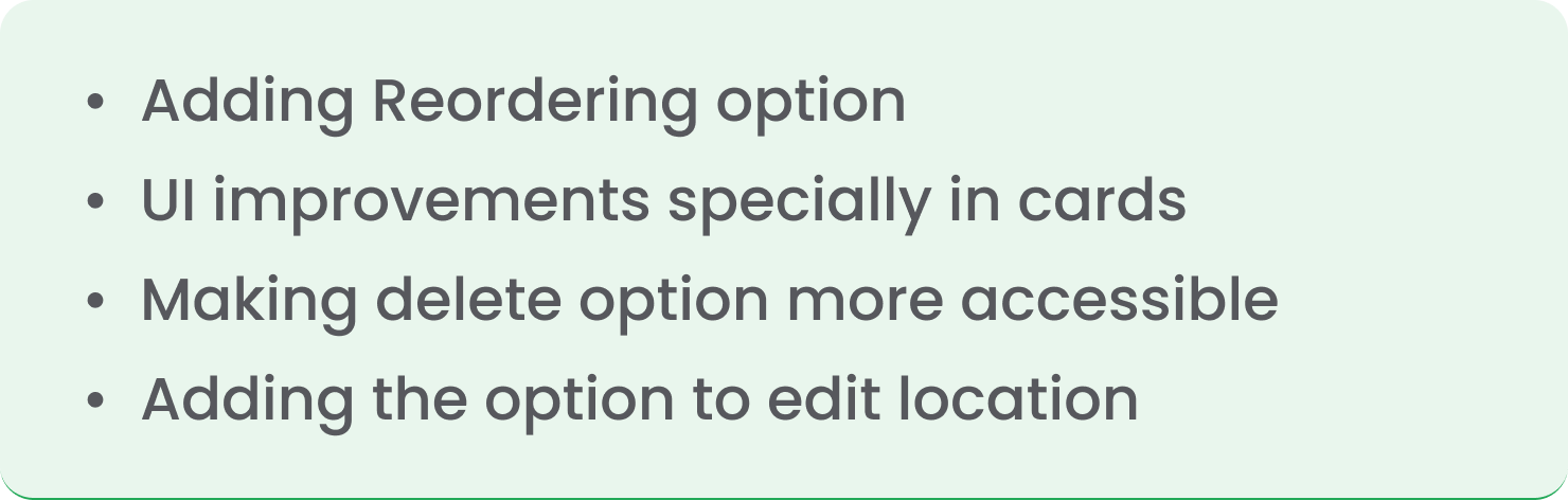
In planning for the future of this project, we've explored
additional enhancements that were postponed due
to limitations in time, technical requirements, and
available resources.These include:
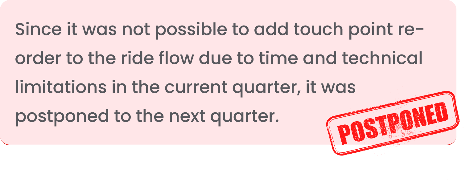
Last one is particularly challenging, as it must be
implemented in a way that does not affect or disrupt
ride timing.
.png)