.png)
Snapp, known as the Uber of Iran, has over 60 million users and is the largest and fastest-growing internet company in the Middle East. This super app offers a variety of services, but its ride-hailing service is the most widely used, with 5 million rides per day.
To address data privacy concerns and comply with Google's rules, Snapp aims to introduce an easy in-app method for users to permanently delete their accounts.
.png)
Google now requires Play Store apps to include the ability for users to delete their accounts within the application. In light of current events, protests, and user feedback on social media and through call centers, addressing concerns about privacy, data security, and account management has became essential which made us think: How might we create a positive farewell experience for users?
.png)
.png)
Creating a user-friendly account deletion feature within
the app, addressing data privacy and security concerns,
to improve the overall user experience in response to
growing privacy demands.
But how can we know if we
have reached our goal if we can’t measure it?
Currently, passengers initiate account deletion by calling the center. The call center team reviews requests in the CRM, tracking interactions without ask about reasons. Valid requests are processed via a Google Form, checked daily by agents against specified conditions. If met, the agent proceeds to remove the account.
.png)
The average review time for deletion requests is approximately 14 days.
.png)
As a short-term solution, following discussions with
the product manager, I proposed adding a new
category for user account deletion to the support
page of the passenger application. I had previously
heard that this could be managed by the back-end.
Regarding the time constraints, this cost-effective,
temporary solution aligns with new rules, both
preventing the application's removal from the Google
Play Store and providing an opportunity to
understand why users want to leave our application.
Due to a lack of research resource at that time, I conducted an analysis of 300 submitted tickets during one month from 2022-08-01 to 2022-09-01 through tagging.
.png)
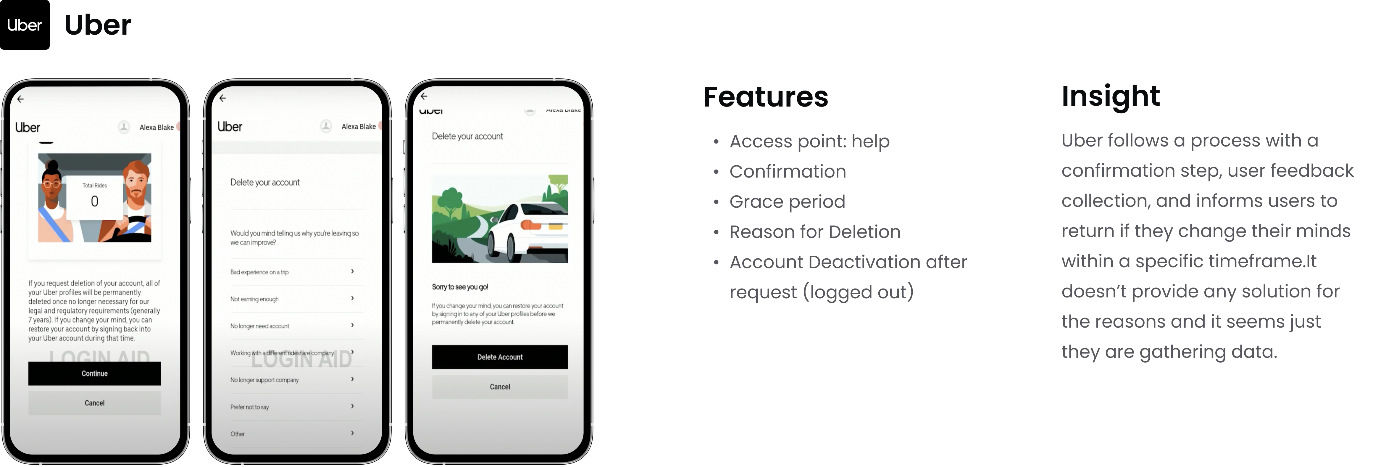
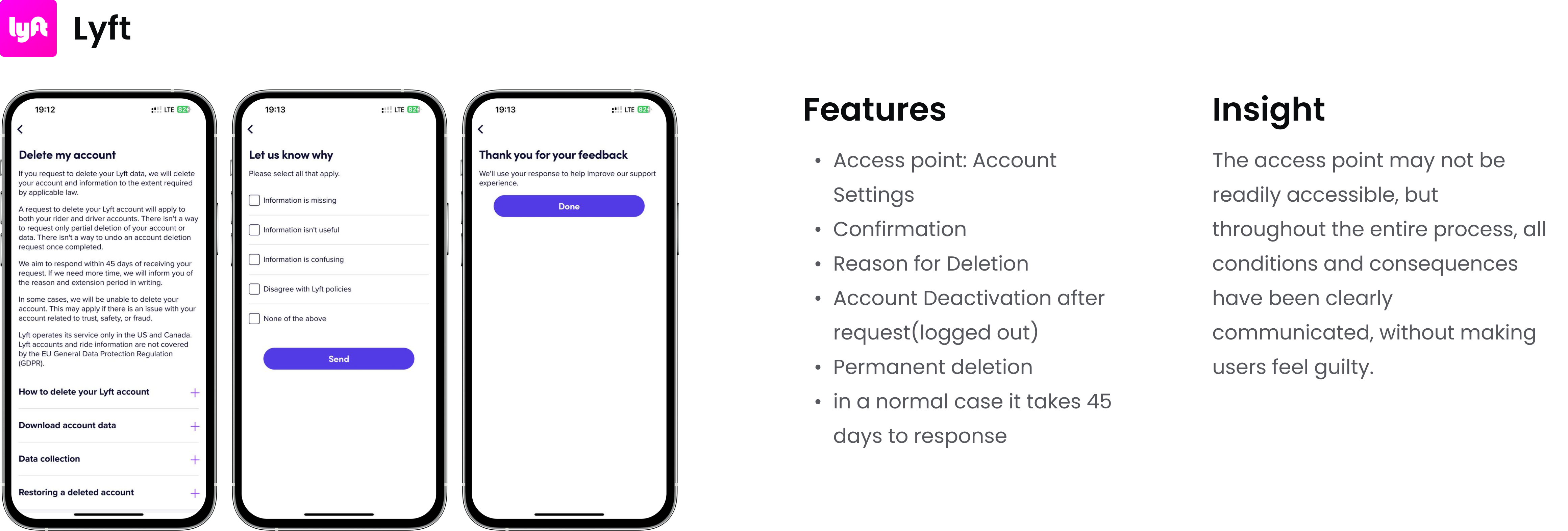
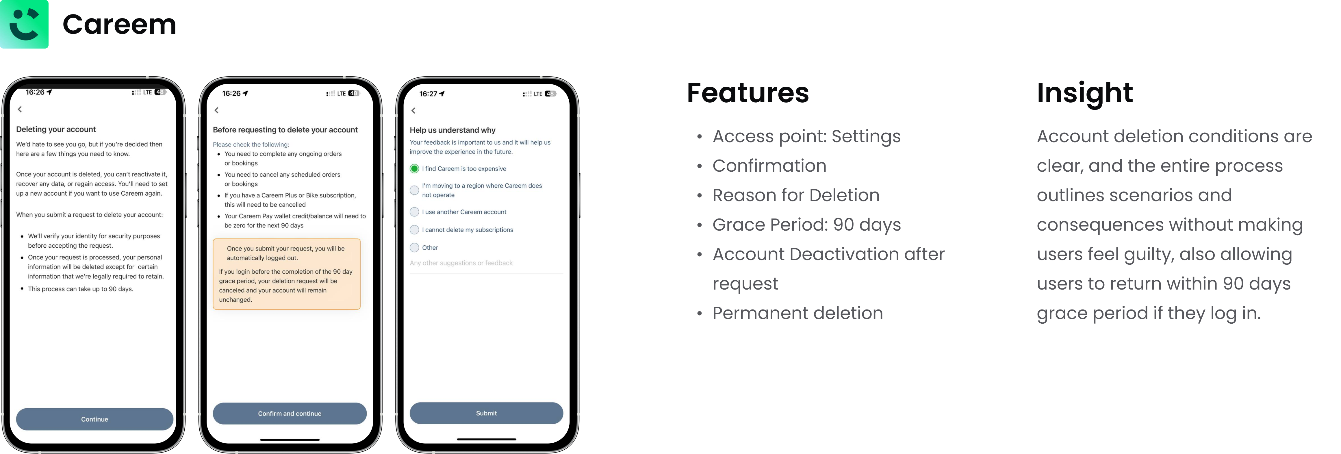
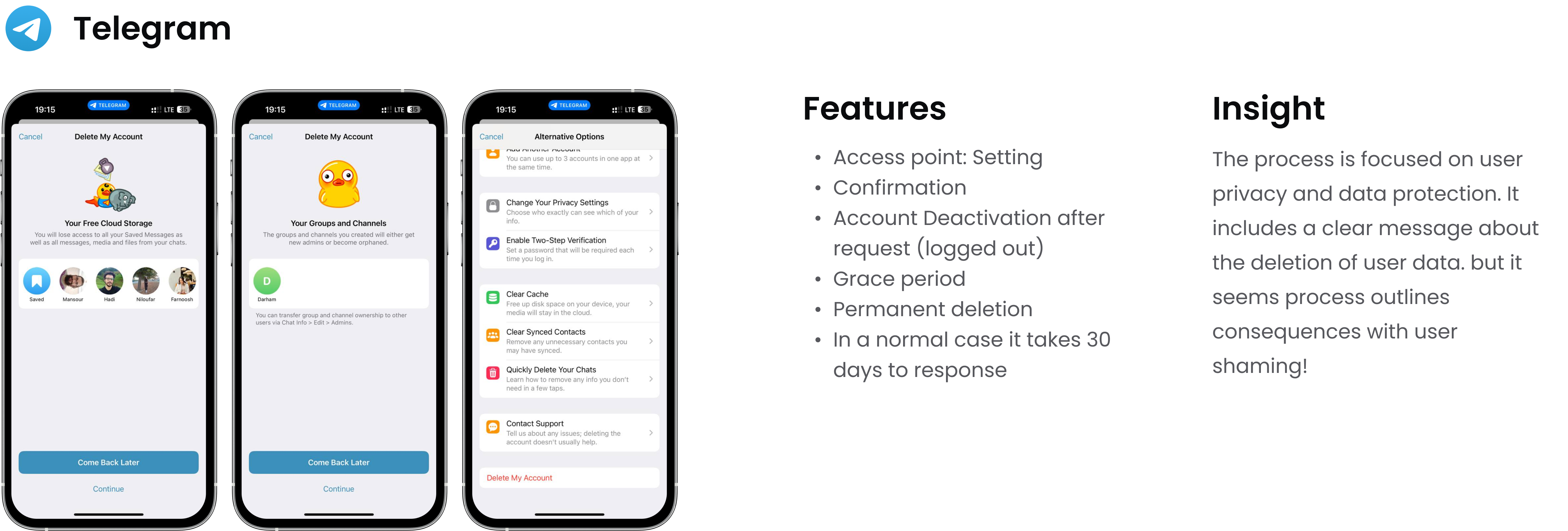
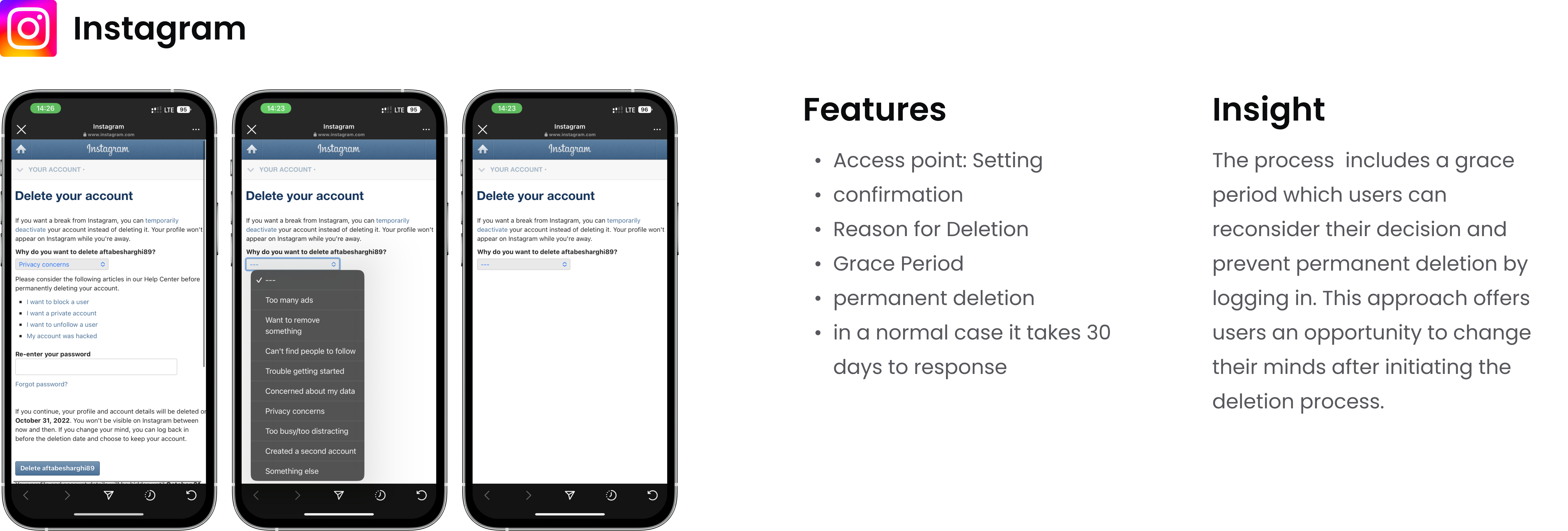
To craft a user-friendly account deletion experience, we conducted benchmarking to study the approaches of similar apps and popular apps that offer account deletion options, with the aim of identifying best practices.
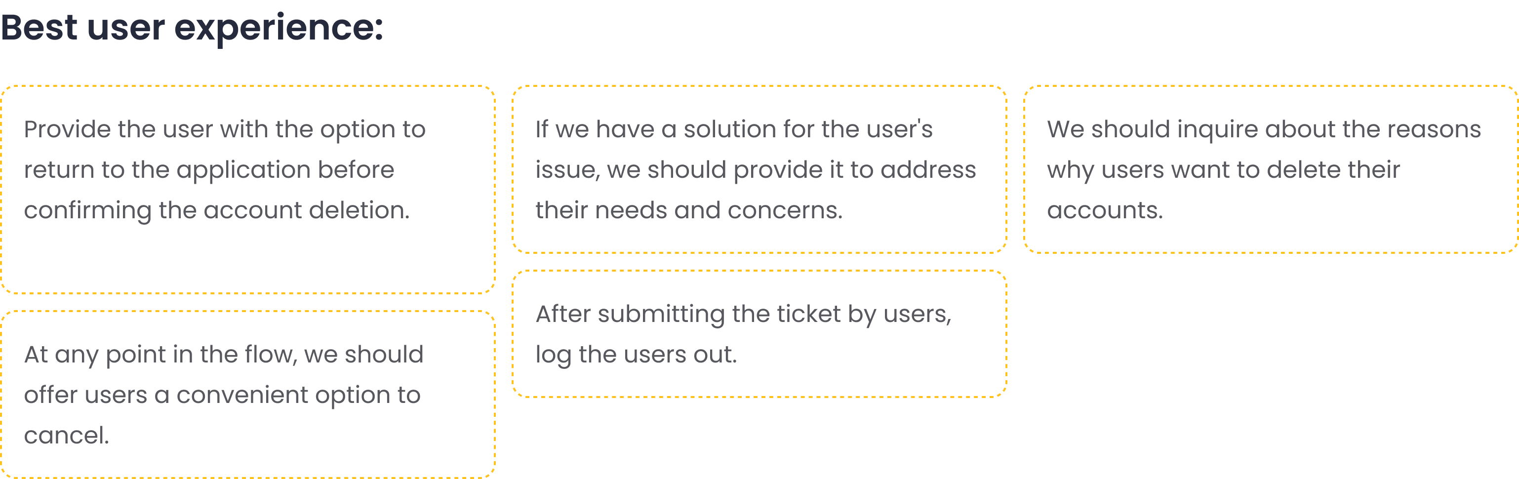
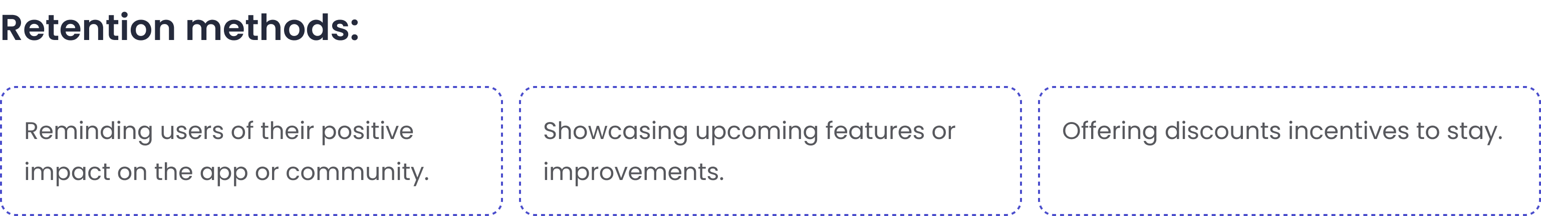
With our first ideas brought to life, I wanted to involve the entire stakeholders and our internal design team in the early stage concepts because creating such a feature required many minds. with these questions:
How can we make the process more transparent and user-friendly?
What incentives or positive reinforcements can be introduced to encourage user retention?
.png)
Then I categorized the outcomes of the brainstorming session along with the insights got from the benchmark into four distinct categories:
I prototyped some of my ideas in constant communication with my PM, my design lead, UX writer and fellow designers on my team so I could compare them to find out what works best.
.png)
I Tried to think critically about all the benchmarks, ideas and wireframes I had designed, and what happened was that some ideas made me think that:
.png)
How did we solve the challenges?
After reading a few articles, researching and thinking more, I came to the conclusion that:
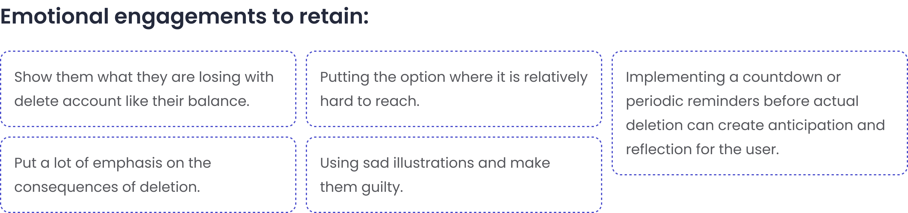
This is an opportunity to turn exiting users into brand ambassadors. While some companies use manipulative tactics to retain users, providing a positive off boarding experience is critical just as important as onboarding. Users who leave with a good impression may return or recommend the service to others, highlighting the importance of trust and reputation in retaining and attracting customers. As a result, ideas that seemed hostile and might involve the user's emotions or were more determined to keep the users were discarded.
.png)
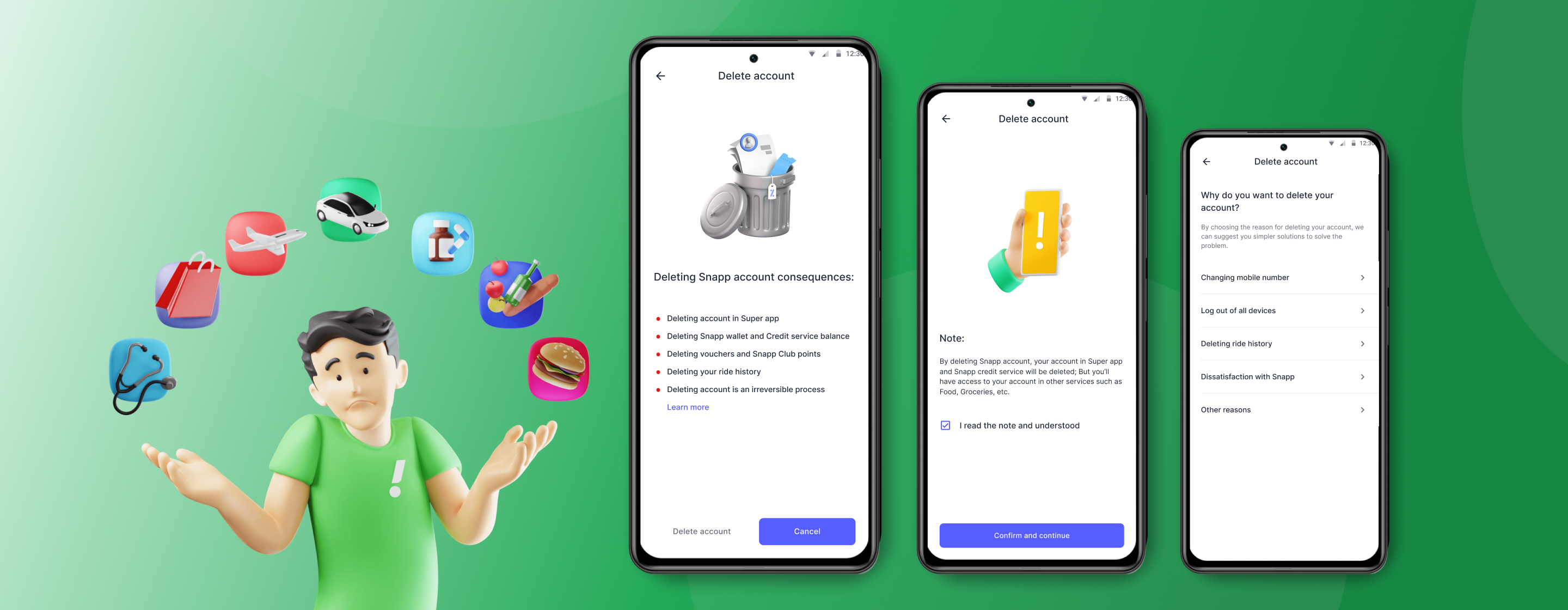
Each consequence in single page
There are at least 4 major consequences and it
requires more actions to be taken by the users
and also lengthens the flow which will not be a
good experience for the user.
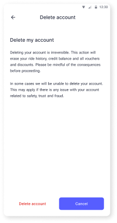
Handling all results on a page with text
Explaining all the consequences of account deletion to users
with text on a page, which we also saw in the benchmark
Considering that the writing is not final and if we
want to handle all the consequences with text in
the form of captions on this page, the text content
on this page will be too much and it will be boring
for the user.
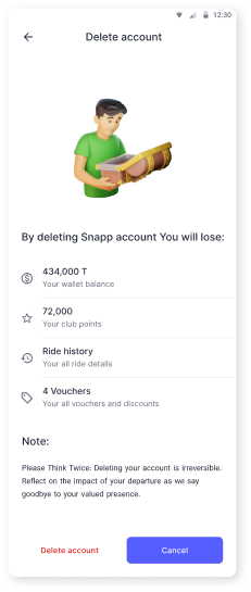
What exactly is lost?
Showing exactly what users are losing, for example, showing
exactly what balance of their wallet is being lost. Also, use a
related illustration that complements the content of the text and list
Technically, we are not able to display some
detailed items such as balance and we can only
talk about it in general terms.
.png)
I've iteratively redesigned this flow, considering numerous possibilities and ensuring all corner cases are addressed and to facilitate a clear understanding for developers.
You can see the prototype here.
.png)
My researcher and I conducted a navigation test to assess both how easily participants could find the feature and the ease of navigating the "Delete Account" flow . We worked with 10 participants:
These results clearly show that our navigation design is intuitive and effective. Based on the findings, we didn’t identify the need for any major adjustments before rolling it out.
Following the rollout of the delete account feature, we conducted a thorough assessment of our metrics so far. The results indicate notable improvements, particularly in three key metrics:
For confidentiality reasons, I have omitted the actual values for these metrics.
These positive outcomes collectively underscore the success of the updated delete account feature, demonstrating its effectiveness in enhancing the user experience across various dimensions.

.png)